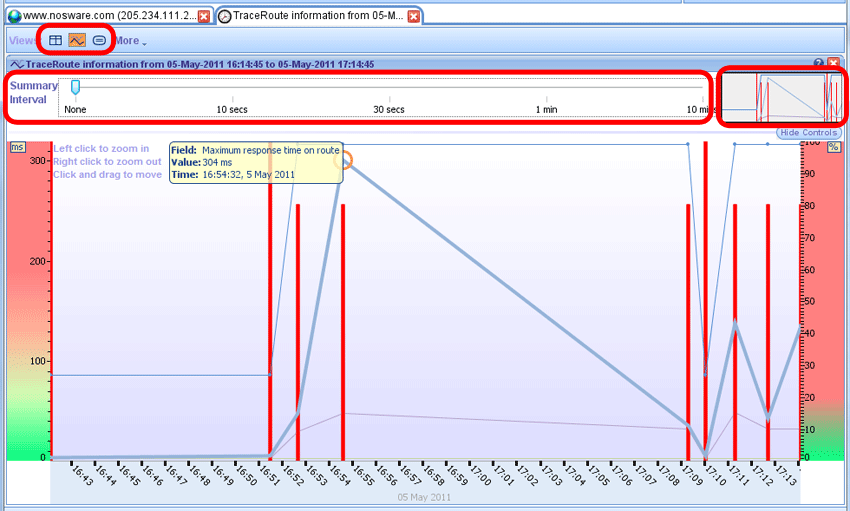
Traceroute information Graph
A traceroute information graph has three plotted lines. These are route length, Maximum response time on route and response time to target. A mouse over pop up will appear to show the type, value and time of any given point plotted.
The vertical red bars denote maximum given packet loss for a given route. So if the highest packet loss was 80% at hop 10 then the bar will be plotted at 80%.
Switching between the views is simply done by using the View menu, circled at the top of the image below. Simply click on the view required to open and close. Each view can also be closed by clicking on the red x at the top right hand of every pane.
The summary interval feature is particularly useful when viewing large amounts of data, for example a 24 hour period. The interval can be altered by simply dragging the indicator left and right. When results are summarized a new metic will be shown in the pop ups, this metric is called Samples. For example if a graph is being summarized by 1 minute and 4 traceroutes fall within a 1 minute window the the samples metric will be 4. This indicates that the results plotted are based on an average of 4 sets of results.
The preview window (circled to the top right of the image below) is useful when viewing large amounts of data. The graph can also be navigated by clicking on a section of the preview window.

Round Trip Time (RTT) and Packet Loss Graph
A round trip time and packet loss graph has one plotted line showing the round trip time for a hop. A mouse over pop up will appear to show the exact value of the round trip time and when it occured.
The vertical red bars (none in example but the same as image above) denote maximum given packet loss for a given hop, this metric is given in a percentage.
Switching between the views is simply done by using the View menu, circled at the top of the image below. Simply click on the view required to open and close. Each view can also be closed by clicking on the red x at the top right hand of every pane.
The summary interval feature is particularly useful when viewing large amounts of data, for example a 24 hour period. The interval can be altered by simply dragging the indicator left and right. When results are summarized a new metic will be shown in the pop ups, this metric is called Samples. For example if a graph is being summarized by 1 minute and 4 traceroutes fall within a 1 minute window the the samples metric will be 4. This indicates that the results plotted are based on an average of 4 sets of results.
The preview window (circled to the top right of the image below) is useful when viewing large amounts of data. The graph can also be navigated by clicking on a section of the preview window.

|

