The image below shows a typical ping plot analysis and graph for a single IP address.
Each main point is numbered and explained below the image.
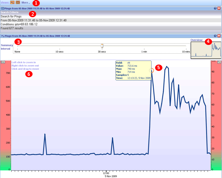
1. Toolbar - The ping history toolbar contains two views (analysis and ping plot) and a more drop down menu. The more drop down menu allows you to add a pane from another currently open tab. For example if you were viewing the history for 200.200.200.200 and you wanted to see how it differered from the live data you could click on the more drop down menu and add the traceroute ping plot pane from a seperate 200.200.200.200 traceroute you were performing.
2. Analysis - The analysis pane summarizes the results of the ping history search. The summary includes the time period chosen, the amount of pings found and the conditions chosen.
3. Summary Interval - The summary interval allows you to change the time line for the graph. If there is a lot of data you may want to increase the summary interval to show less data. You can always use the left and right mouse click to zoom in and out of the graph.
4. Preview - The preview pane shows you the area of the graph you are looking at in relation to all the data shown. This is useful if you have zoomed in a long way and want to see exactly where you are looking. The preview pane can also be used to click and scroll across the data. When you zoom in and out using the left and right mouse click you will see the preview box enlarge or shrink as appropriate.
5. Tooltip - When you move your mouse over a particular point of the graph a tooltip will appear showing you the results for that ping. The data includes the average RTT value, the max RTT value, the min RTT value (all in ms) and the time that the ping occured.
6. Zooming - You can zoom in and out of the graph using the left and right mouse click.
|