The image below shows a typical traceroute analysis and table for a single IP address.
Each main point is numbered and explained below the image.
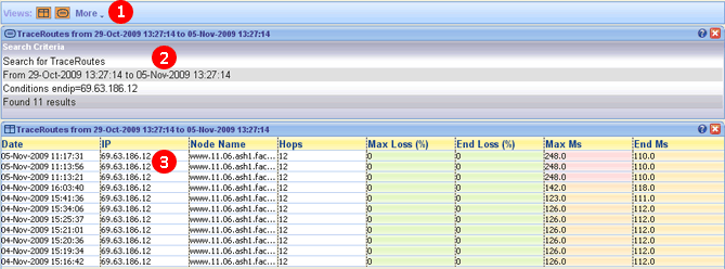
1. Toolbar - The traceroute history toolbar contains two views (analysis and traceroute table) and a more drop down menu. The more drop down menu allows you to add a pane from another currently open tab. For example if you were viewing the history for 200.200.200.200 and you wanted to see how it differered from the live data you could click on the more drop down menu and add the traceroute ping plot pane from a seperate 200.200.200.200 traceroute you were performing.
2. Analysis - The analysis pane summarizes the results of the traceroute history search. The summary includes the time period chosen, the amount of pings found and the conditions chosen.
3. History table - The table shows every traceroute that matches the criteria you chose. Column headings include date, IP, node name, hops, max loss (%), end loss (%), Max Ms and End Ms. The table is color coded to show badly performing traceroutes (as you can see above the top three traces have a particular high max ms so those cells are colored red. If you right click on any row you will get an open option, this allows you to open the full traceroute as a new tab. |